I wrote a fairly extensive piece about four years ago covering the 1959-63 Topps Baseball Presentation Sets, which have long been rare beasts. Friend o'the Archive Don Johnson showed off some of his 1963 Presentation cards recently to a small circle of friends and I was lucky enough to get a viewing and some scans. Some other details have now come to light that are interesting and also add a bit to to the mystery of how these were produced.
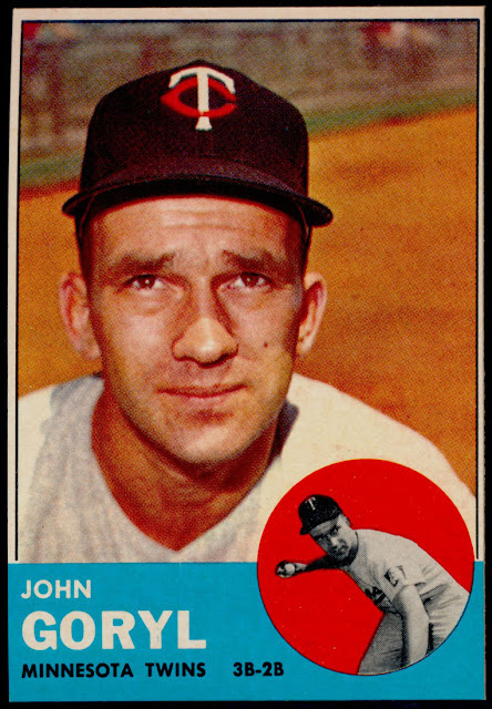
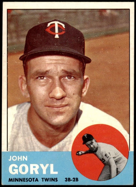
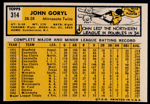
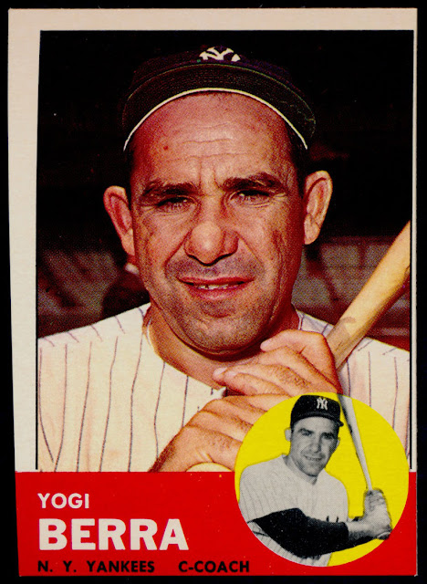
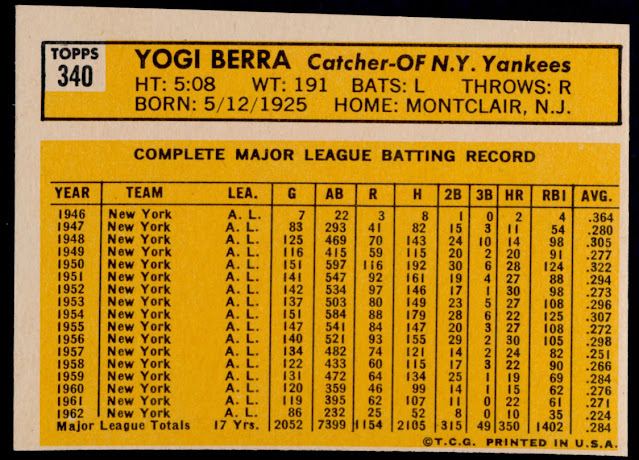
The cards from these special sets have been described as being cut with a beveled edge and some are known to be "slightly" undersized. Well take a look at this John Goryl presentation card, pulled directly from one of the boxes:
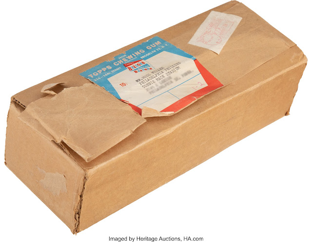
Seeing this, I went back to the mailer I covered in my post from five years ago that sent a 1963 presentation set to a Yankees executive:
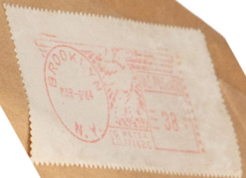
Same date! This all begs a few questions:
- Did Topps save up sheets from each series then cut them up well into the next year's production cycle?
- Did Topps have new sheets printed up to take care of the presentation sets?
- Did some executives write in after the fact to request a set?
- Who cut these things?
Better gloss seems like it's just a matter of applying a shinier varnish, while the more vivid colors can be attributed to a fresh stock of inks or a slightly more intense mix on them. But the cuts can be wild!
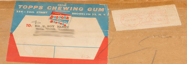
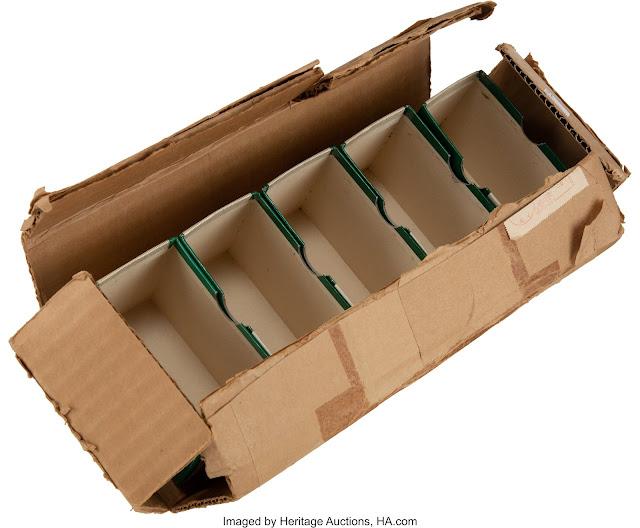
Before I sign off, check out the inside peek at the 1961 mailer:
The date can't be found on this, nor the recipient unfortunately but it illustrates how the cards were packaged (with exposed edges in the smaller boxes), and how tight a fit the outside mailer offered.
So once again, some questions on a Topps obscurity have been answered, which in turn have created new ones. Just another day at the office at the main Topps Archives Research Complex and Vault!


Those shipping boxes are great! Very interesting stuff.
ReplyDelete